Amtrak. Graphic Signage Standards Manual (2010) - page 1
Amtrak ■
August 1995
Revised 2010
Contents
Introduction
1.
Nomenclature and Glossary of Terms
1.0
Amtrak Usage and Style
1.1
Glossary of Terms
1.2
Recommended Abbreviations
1.6
Nomenclature for Platform and Interior Signs
1.7
Nomenclature for Interior Signs
1.8
Nomenclature for Exterior Signs
1.9
Nomenclature for Regulatory Signs
1.10
2.
Graphic Components
2.0
The Module
2.1
Arrow Module
2.2
Symbol Module
2.3
Frutiger 55 Roman Text
2.4
Frutiger 65 Bold Text
2.5
Text Module, Visual Characters
2.6
Permanent Room Identification
and Station Identification
2.8
Use of Dividers
2.9
Signage System Colors
2.10
Use of Arrows
2.11
Corporate Identity
2.12
Amtrak Specific Symbols
2.13
Passenger Services Symbols
2.14
Public Services Symbols
2.15
Regulatory Symbols
2.16
Symbols of Accessibility
2.17
Preview Bar Symbols
2.18
Other Carriers
2.19
3.
The Americans with Disabilities Act (ADA)
3.0
History of the Act
3.1
ADA Highlights
3.2
Graphic Overview of the ADA
3.6
4.
Platform Signage (A Sign Types)
4.0
5.
Interior Signage (B Sign Types)
5.0
6.
Exterior Signage (C Sign Types)
6.0
7.
Regulatory Signage (D Sign Types)
7.0
8.
Electronic Signage (E Sign Types)
8.0
■
Contents
(continued)
9. Typical Sign Location Plans
9.0
Message Hierarchy
9.1
Historical Buildings
9.2
Typical Platform Plans
9.3
Typical Station Plans
9.7
10. Recommended Maintenance of Signs
10.0
Maintenance and Parts Replacement
10.1
Cleaning
10.2
Why Coating Systems Fail
10.3
11. Sign Fabrication and Installation
11.0
The Amtrak Paint System
11.1
Graphics Application
11.2
Sign Construction Drawings
11.3
12. Sign Ordering Forms
12.0
The Ordering Process
12.1
Master List of Sign Types
12.2
Three Steps for Ordering Signs
12.5
Sample Ordering Form
12.7
Master Ordering Form
12.8
Ordering Electronic Signs
12.9
■
Introduction
The 2009 revision of the Amtrak Graphic Signage
Standards Manual has many updates and additions that
bring the Amtrak signage system into the 21st Century.
The original manual, issued in 1995, was revised in 2001
to incorporate many of the changes associated with the
introduction of Amtrak's new brand that was unveiled
in 2000.
This 2010 revision incorporates new Amtrak branded
Sign Types, Acela Express Sign Types, vehicular trail-
blazer signs and completely updated electronic Sign
Types. This revision also contains an overview of the
new Americans with Disabilities Act (ADA) design
guidelines, as published in 2004 and amended in 2005,
regarding signage. To contribute to a greener planet,
the paint specifications in this revision have been
changed to VOC compliant formulations with reduced
organic volatile compounds (VOCs).
The original manual was developed with multi-depart-
mental coordination within Amtrak and was designed
by McCulley Design Group, LLC (environmental graphic
design services). The McCulley Group, LLC subsequently
revised the original manual in 2001 to include new
Sign Types and graphic content developed by Calori &
Vanden-Eynden, Ltd., who prepared this revision of the
manual.
In order to reinforce Amtrak’s brand image it is impor-
tant that the guidelines outlined in this manual be
followed to maintain signage consistency. When it is
necessary to replace an existing sign or install a new
sign it is important that the personnel responsible
consult the Amtrak Graphic Signage Standards Manual
and refer to the ordering procedures outlined in
Chapter 12.0.
■
Introduction
(continued)
Adherence to the
Every day employees, passengers, and the general
Amtrak Graphic Signage
public form impressions about Amtrak. How Amtrak
Standards Manual not
communicates is a vital expression of its marketplace
only maximizes the visi-
identity and must support the unique quality of
bility of Amtrak stations,
its people, service and environment. Advertising,
but also greatly increases
sales promotion collateral, architecture, interiors,
the recognition of the
displays, corporate identity, facility and transportation
Amtrak brand image
identification all contribute significantly to Amtrak's
and enhances Amtrak's
perceived image.
market presence.
All interior/exterior identification components and
The policies in this
interior space must support and reinforce the brand
manual are required
image established for Amtrak and its passengers.
to detail the use of
Of major importance is to give the impression that
the Amtrak brand signa-
the entire station is unified with understandable
ture as applied to all
sequences of information.
Amtrak stations.
Signage for Amtrak stations establishes a permanent
display of the Amtrak corporate identification that
extends beyond the simple and generic graphic
communicative requirements of a train station.
Signage design and the degree of consistency with
which signs are fabricated and installed in our
stations makes a collective statement to the public
about the character of Amtrak and the level of service
experienced.
The choice of signage materials is largely determined
by the environmental conditions they are expected
to resist and the performance requirements desired.
Materials in this manual have been selected according
to their ability to withstand extreme exposure to sun,
cold, snow and high levels of humidity or rain.
The goal of the Amtrak Graphic Signage Standards
Manual is to convey a consistent corporate image of
strength and reliability, reflecting a brand that puts
the safety, comfort and enjoyment of every passenger
first. Applied consistently, the signage will stand for
Amtrak and its role in the travel marketplace. The use
of a consistent graphic system enhances the passenger
experience, providing both real and perceived reassur-
ances at all phases of the station experience.
This manual is a corporate identity program created
to establish an Amtrak system for national sign instal-
lation and placement guidelines. This system as of
■
Introduction
(continued)
date of publication will assist in the long-term strategy
required to address conformance with the Americans
with Disabilities Act (ADA). The ADA mandates that all
public accommodations and public facilities be acces-
sible to people with disabilities.
This manual is intended to be used as a whole so it is
important for users to familiarize themselves with its
organization and with its entire contents. For example,
the Sign Type information provided in Chapters 4.0
through 8.0 is complemented and supported by infor-
mation in the other chapters.
This manual is organized as follows:
• Chapters 1.0 through 3.0 of this manual contain
important information on the building blocks of
Amtrak's sign system.
• Chapters 4.0 through 8.0 provide information about
each Amtrak Sign Type, typically presented in four
subject areas: Sign Overview, Mounting Options,
Sign Size and Layout, and Design Intent Drawing.
• Chapter 9.0 describes where the various Amtrak
Sign Types should be located at various types of
platforms and stations.
• Chapter 10.0 contains sign maintenance procedures.
• Chapter 11.0 contains information on sign fabrica-
tion and installation.
• Chapter 12.0 outlines the sign ordering process.
In order to control the product and brand qual-
ity of Amtrak signage, signs must be ordered
through Amtrak Brand Management, contact:
SignageBrandManagement@amtrak.com.
For information on non-signage applications of the
Amtrak brand, contact: BrandManagement@amtrak.
com.
Also see Station Design Guidelines, available at
■
Nomenclature and
1.1
Glossary of Terms
Amtrak Usage
and Style
Grammar
To avoid confusion and
ambiguity, all mes-
• Messages should be brief. Avoid unnecessary words
sages in the Amtrak
and punctuation.
Graphic Signage
• Sentences should be constructed clearly and deci-
System must be com-
sively. Redundancy must be avoided.
municated with clar-
• A positive tone must accompany all messages.
ity and consistency in
The use of “only” should be avoided in messages.
terminology, grammar,
and style.
Style
The guidelines listed
• A titling style, where all words begin with a
in this chapter are to
capital letter except for articles, prepositions
be followed closely
and conjunctions is to be used consistently
when developing
throughout the system.
messages for Amtrak
• All sign messages are to be displayed in non-italic
signs.
characters.
• Letters and words shall be spaced horizontally
according to guidelines established by the ADA.
Text shall not be tightly spaced to fit on an
improperly sized sign.
Punctuation
• Punctuation should be avoided where possible.
• Hyphens are not to be used in unconventional
ways; they should not be used in place of a
comma, in place of the word “to” or in place
of a dash. Coined words such as “Drop-off“ and
“Smoke-free” must appear hyphenated on all
signs.
• The ampersand (&) is to be used in place of the
word “and” only when connecting two words that
belong together because of their function.
Abbreviations
• Abbreviations are generally to be avoided.
Exceptions will be made in cases of common and
widely understood words displayed with insuffi-
cient space. For a list of acceptable abbreviations
refer to page 1.6.
• Abbreviations are to be used without punctuation.
Nomenclature and
Glossary of Terms
1.2
Glossary of Terms
The following defini-
Accent Bar: An essential part of most Amtrak signs,
tions have been
it consists of a narrow horizontal stripe of color
compiled to assist in
placed at the lower end of signs where applicable.
the process of under-
The Accent Bar is always painted to match AMT Silver.
standing and applying
Accessibility: The combination of elements within a
the Amtrak Graphic
facility which allows access, circulation and full use of
Signage System.
the area by persons with disabilities.
ADA: The Americans with Disabilities Act. Signed into
law on July 26, 1990.
AMT: Prefix used to identify Amtrak colors specified
throughout the Graphic Signage Standards Manual.
Arrow Field: An essential part of all directional signs,
it consists of a square area determined by the length
of the arrow from base to point. The Arrow Field
determines the placement of an arrow within the
Module and is not reproduced on the actual sign.
Assistive Listening Systems: Products designed to
improve the quality of sound delivered to a listener
with hearing loss, but who can understand speech.
Brandmark: Amtrak’s corporate signature or
logotype.
Custom Message: Messages not included in the
Amtrak nomenclature that provide specific informa-
tion about or direct passengers to areas unique
to Amtrak facilities are referred to as “Custom
Messages.” Consistency in the use of grammar, style
and punctuation must be used when compiling such
messages.
Direction Bar: Used on City Identifiers (A2 Sign
Type), this horizontal message module is used to
display a train’s general path of travel. This module
includes names of major origin/destination cities and
reinforces the train’s direction through the use of
arrows.
Electronic Signage: Computer or manually con-
trolled variable message signs that dynamically display
messages on electronic display devices such as LEDs or
Flat Screen Monitors.
Flat Screen Monitor: Typically Liquid Crystal Display
(LCD) screens; used in electronic display systems.
Grade 1 Braille: A letter-by-letter conversion of text
into Braille cells. Also referred to as “simple Braille.”
■
Nomenclature and
1.3
Glossary of Terms
Glossary of Terms
(continued)
Grade 2 Braille: Specified by the ADA, this type
of shorthand was developed in 1932 for books and
contains approximately 200 abbreviations, making it
quicker to read than Grade 1 Braille. Contractions are
based on phonetics requiring expertise to translate
and convert messages onto signs. This manual only
specifies Grade 2 Braille.
Grid: A framework of intersecting, equally-spaced
parallel and perpendicular lines applied to the
Module, used as a guide for the placement of graphic
components.
Large Stations: Stations that handle moderate to
heavy passenger loads of 150-300 passengers per peak
hour.
LCD: Liquid crystal display; used in electronic display
systems, typically for Flat Screen Monitors.
LED: Light emitting diode; used in electronic display
systems, typically in matrices.
Logo Curve: The combination of the white Amtrak
logo and a curved Amtrak Blue field that creates a
distinctive brand statement on certain Amtrak Sign
Types.
Medium Stations: Stations that handle moderate
passenger loads of 50-175 passengers per peak hour.
Module: Based on the grid, the Module is the back-
ground structure applied to all Amtrak sign layouts.
Permanent Rooms: Rooms and spaces whose desig-
nation will not change. Signage for Permanent Rooms
must comply with ADA sections 703.1, 703.2, 703.5,
and with 703.6 where Pictograms identify Permanent
Rooms.
Pictogram: See Symbols.
Preview Bar: Message module used in directional
signs to display, in pictorial form only, upcoming ser-
vices and facilities explained later on additional signs
that include text messages. The Preview Bar (painted
white) incorporates the use of ten (10) Amtrak desig-
nated Preview Bar Symbols.
Preview Bar Symbols: Commonly recognized
Symbols (painted to match AMT Blue) used to com-
municate the locations of upcoming services without
accompanying text.
Nomenclature and
Glossary of Terms
1.4
Glossary of Terms
(continued)
Raised Character Messages: Messages displayed
in capital letters of at least 5/8 inches in height—not
to exceed 2 inches—and raised 1/32 inch minimum
from the sign surface that can be read using the sense
of touch. Raised Characters are used in combination
with Grade 2 Braille to comply with ADA regulations
for Tactile lettering, and can also serve as Visual
Characters in some situations.
Shelters: Structures located where minimal passenger
loads of up to 25 passengers are anticipated per peak
hour.
Signage: An organized system of signs.
Small Stations: Stations that handle light passenger
loads of 25-75 passengers per peak hour.
Static Signage: Signs that are manufactured with
solid and stable materials, intended to be mounted
and remain stationary throughout their life expec-
tancy. Messages on static signs do not vary and are not
displayed electronically.
Symbol Module: Circular field in which symbols are
contained. Used to support text messages in signs.
Symbols: A pictorial representation of an object or
activity. Also referred to as pictograms or icons.
Tactile Characters: Characters intended to be read
by the sense of touch, including Raised Characters and
Braille.
Text Telephone: Equipment used to serve people
with hearing and/or speech impairments. Text tele-
phones employ interactive graphic communications by
transmitting coded signals across a standard telephone
network. Also referred to as TTY.
Travelscape: Large format wall mural located behind
ticket counters, in conjunction with the Amtrak
Brandmark.
PIDS: Passenger Information Display System. These
electronic display systems provide passengers with
variable information relevant to train departure,
arrival, station services and special notices. PIDS also
serve the purpose of a visual paging system through
free text entries.
■
Nomenclature and
1.5
Glossary of Terms
Glossary of Terms
(continued)
Visual Messaging Systems: These PIDS signs are
used on platforms and in stations to display station
announcements with equivalent public address
announcements so those with hearing impairments
can be kept informed. Amtrak’s Visual Messaging
Systems display messages through the use of LEDs and
flat screen monitors.
Visual Characters: Characters intended to be read by
the sense of sight. Visual Characters can also serve as
Raised Characters if they comply with ADA 703.2.
VOC: Volatile Organic Compound. This manual speci-
fies low VOC paint coatings to reduce environmental
impact and/or to comply with governing environmen-
tal regulations.
Nomenclature and
Glossary of Terms
1.6
Recommended
Abbreviations
Name
Abbreviation
First
1st
Second
2nd
Third
3rd
Fourth
4th
Fifth
5th
Sixth
6th
Seventh
7th
Eighth
8th
Ninth
9th
Tenth
10th
Sunday
Sun
Monday
Mon
Tuesday
Tues
Wednesday
Wed
Thursday
Thurs
Friday
Fri
Saturday
Sat
Afternoon/Evening
pm
Morning
am
Weekend
Wknd
Maximum
Max
Minimum
Min
Express
Exp
Avenue
Ave
Boulevard
Blvd
Street
St
■
Nomenclature and
1.7
Glossary of Terms
Nomenclature
for Platform and
Interior Signs
Proper Amtrak Nomenclature
Example
Platform Signs
Caution
“City Name, State Abbreviation”
Oakland, CA
+ “Direction/Direction”
Los Angeles/Seattle
Elevator
Escalator
Location “Alpha Designator”
Location C
Luggage Carts
Track “#”
Track 4
To Station
No Standing
Notice
Warning
Interior Signs
Amtrak Express
Amtrak Police
Amtrak’s Metropolitan Lounge
Arrivals/Departures
ATM
Authorized Personnel
Baggage Check-in
Baggage Claim
Baggage Storage
Buses
Other transportation systems
Metra, Long Island Rail Road, etc.
within facility
Children’s Play Area
ClubAcela
Customer Services
Elevator
Escalator
Exit
Gate “Alpha Designator”
Gate B
Information
Janitor’s Closet
Lockers
Lost and Found
Nomenclature and
Glossary of Terms
1.8
Nomenclature
for Interior Signs
(continued)
Proper Amtrak Nomenclature
Example
Interior Signs
Luggage Carts
Mail Drop
Mechanical Room
Men
“Numerical Designator”
1, 2, 3, 4, etc.
Parcel Check
Parking
Parking Garage
Please Wait for Next Available Agent
Private
Quik-Trak
Rental Car
Avis, Hertz, etc.
Restaurant
Restroom(s)
Room “#”
222
Shops
Station Manager
Taxis
Telephones
Text Telephones
The Nearest “Service”
The Nearest Text Telephone Is
Is Located “Location”
Located across from Amtrak’s
Metropolitan Lounge
Ticket Window Hours:
Ticket Window Hours:
“00:00am - 00:00pm”
6:00am - 11:00pm
Ticketed Passengers Only Beyond This Point
Tickets
Tickets & Baggage Claim
Timetables
To Trains
Trains
Vending
Water Fountain
Women
■
Nomenclature and
1.9
Glossary of Terms
Nomenclature
for Exterior Signs
(continued)
Proper Amtrak Nomenclature
Example
Exterior Signs
Amtrak Thruway Bus
Amtrak Welcomes You to
Amtrak Welcomes You to
“Station Name”
Chicago Union Station
Station Hours:
Station Hours:
“00:00am - 00:00pm Days of Week”
4:00am - 11:30pm Mon - Fri
“00:00am - 00:00pm Alternate
6:00am - 10:30pm Sat - Sun
Days of Week”
Bicycle Parking
Emergency Parking Zone
Employee Parking
Loading Zone
Long-term Parking
Luggage Carts
No Parking
No Parking Between Signs
No Standing
Parking
Parking by Permit
Passenger Drop-off
Passenger Drop-off & Pick-up
Passenger Parking
Passenger Pick-up
Redcap Phone
Rental Car
Avis, Hertz, etc.
Reserved Parking
Short-term Parking
Standing
Standing
“#” minutes max.
10 minutes max.
“Station Name”
Chicago Union Station,
Orlando Station
Taxis
Line Begins Here
The Nearest “Service”
The Nearest Accessible
is Located “Location”
Entrance is Located
on 7th Avenue
Nomenclature and
Glossary of Terms
1.10
Nomenclature
for Regulatory Signs
(continued)
Proper Amtrak Nomenclature
Example
Regulatory Signs
Amtrak Personnel Only
Area of Rescue Assistance
Authorized Personnel
Caution
Do Not Enter
Exit
Fire Extinguisher
In the Event of Fire
Use Stairs
Notice
Restricted Area
Smoking Area
Stairway
Telephone(s)
This Is a Smoke-free Facility
Warning
■

Graphic
2.1
Components
The Module
8x
The module illustrated
on this page is the back-
x
ground structure applied
to all Amtrak sign layouts.
The function of the
x
module is to maintain a
common relationship and
unity among all signs.
The module consists of
a grid subdivided into
64 equal units*, eight
units* high and eight
8x
units* wide.
*x=length of one unit
*x=width of one unit
8x=length of one module
8x=width of one module
module

Graphic
Components
2.2
Arrow Module
To establish a relation-
8x
ship between arrow,
x
symbol and text,
the arrow is always
contained within the
x
arrow field. The arrow
1-1/2x
field is determined by
the arrow’s length from
base to point. The height
and width of the arrow
module are five (5) units*
of the module.
8x
5x arrow field
The diagram on this page
Point
Base
illustrates the placement
of the arrow field within
the module. The arrow
field is for arrow place-
ment only and is not
reproduced on the actual
sign.
The directional arrow
used in this manual was
designed for maximum
legibility under various
5x arrow field
1-1/2x
viewing conditions.
This arrow style has
been adopted by the
International Civil
Aviation Organization
(ICAO). It is recom-
mended for use in inter-
national applications.
For Amtrak arrows see
page 2.11.
*x=length of one unit
*x=width of one unit
8x=length of one module
8x=width of one module
■

Graphic
2.3
Components
Symbol Module
8x
Symbols have been incor-
porated into the system as
x
a supplementary
communication tool.
x
Symbols used in this
manual are based on the
“System of Passenger/
Pedestrian Orientation
Symbols” developed for
the U.S. Department of
Transportation by the
American Institute of
5x
6x
8x
C
L
Graphic Arts and the
placement
symbol
Society of Environmental
margin
field
Graphic Design’s symbols
of accessibility.
In some cases, symbols
have been modified to
meet particular Amtrak
needs. These new symbols
are the exclusive property
of Amtrak and the
services they represent.
C
L
To continue the relation-
ship between arrow,
symbol and text, the
symbol is always conŧained
within a symbol field. The
symbol field consists of
a circle with a diameter
equivalent to six (6) units*
of the module.
The diagram on this page
illustrates the placement
of the symbol field within
the module. The symbol
is centered within the
margin illustrated by the
dotted line and is equiva-
lent to five (5) units* of
the module. For Amtrak
symbols see pages 2.13-
2.18.
*x=length of one unit
*x=width of one unit
8x=length of one module
8x=width of one module
Graphic
Components
2.4
Frutiger 55 Roman
Text
The Frutiger 55 Roman
typeface is the standard
A B C D E F G H I J K L M N
typeface for Amtrak
sign text. It is easy to
O P Q R S T U V W X Y Z
read and understand.
Clear and recognizable,
Frutiger 55 Roman meets
a b c d e f g h i j k l m n
ADA guidelines for
both Raised and Visual
Characters.
o p q r s t u v w x y z
Frutiger is a sans serif
type family designed
1 2 3 4 5 6 7 8 9
0
in the humanistic style,
making it compatible
with both historical and
Frutiger 55 Roman (Frutiger 55) style
contemporary station
designs.
Frutiger 55 Roman is
used on permanent and
temporary signage for
Character Spacing (Tracking)
Amtrak facilities.
Frutiger 55 Roman should never be letterspaced more tightly
Frutiger 55 Roman is to
(negative) than “Track 0” or “Normal”, and may require more
be used on sign faces
open (positive) tracking to meet ADA character spacing guide-
only when specified in
lines for Visual Characters and for Raised Characters.
the design intent draw-
ings provided in this
manual for each Sign
Type.
The alphabet shown here
is for reference only; it
should not be used for
reproduction or as final
“artwork”. No other
Frutiger font (light,
condensed, italic, etc.)
should be substituted for
Frutiger 55 Roman.
■
Graphic
2.5
Components
Frutiger 65 Bold Text
The Frutiger 65 Bold
A B C D E F G H I J K L M N O
typeface is used on
permanent and tempo-
rary signage for Amtrak
P Q R S T U V W X Y Z
facilities. Frutiger 65 Bold
meets ADA guidelines
for Visual Characters only
a b c d e f g h i j k l m n o
and should not be used
for Raised Characters.
p q r s t u v w x y z
Frutiger 65 Bold is to be
used on sign faces only
when specified in the
1 2 3 4 5 6 7 8 9 0
design intent drawings
provided in this manual
for each Sign Type.
Frutiger 65 Bold (Frutiger 65) style
The alphabet shown here
is for reference only; it
should not be used for
reproduction or as final
Character Spacing (Tracking)
“artwork”. No other
Frutiger font (light,
Frutiger 65 Bold should never be letterspaced more tightly
condensed, italic, etc.)
(negative) than “Track 0” or “Normal”, and may require more
should be substituted for
open (positive) tracking to meet ADA character spacing guide-
Frutiger 65 Bold.
lines for Visual Characters and for Raised Characters.

Graphic
Components
2.6
Text Module,
Visual Characters
To continue the relation-
8x
ship between arrow,
x
symbol and text, all text
messages are placed
on the module. Several
factors must be consid-
2x
ered in establishing the
placement and size of
text:
Line hangs from
a. The size of the module
this point
b. The length of the
message
8x
4x
c. The specific Sign Type
One-line Message
Signs
Text size refers to the
size of capital letters
(cap height) and is deter-
mined by the measure of
four (4) units* within the
module.
Text Module: One Line Message
The text message hangs a
distance of two (2) units*
from the top of the
module and is flushed
left from a margin of one
(1) unit* as illustrated
here.
*x=length of one unit
*x=width of one unit
8x=length of one module
8x=width of one module
Comment
Use square capital letters
such as E or I for cap
height measurement, not
round letters like C or
O because round letters
are designed to be larger
than square letters for
optical balance.
■

Graphic
2.7
Components
Text Module,
Visual Characters
(continued)
8x
Two-line Message
Signs
x
Text size refers to the
size of capital letters
Line hangs from
(cap height) and is deter-
x
this point
mined by the measure of
two (2) units* within the
module.
3x
The text messages hang
a distance of one (1)
unit* from the top of the
Line hangs from
module and are flushed
this point
8x
left from a margin of one
(1) unit* as illustrated.
*x=length of one unit
*x=width of one unit
8x=length of one module
8x=width of one module
Three-line Message
Signs
Text size refers to the size
Text Module: Two Line Message
of lower case letters
(x-height) and is deter-
mined by the measure of
8x
one (1) unit* within the
x
module.
The messages hang a
distance of one (1) unit*
Line hangs from
x
this point
from the top of the
module and are flushed
left from a margin of one
2x
(1) unit* as illustrated.
Line
1
Line hangs from
this point
*x=length of one unit
*x=width of one unit
8x=length of one module
8x
2x
Line
2
8x=width of one module
Line hangs from
this point
1x = x-height
Line
3
Text Module: Three Line Message
Graphic
Components
2.8
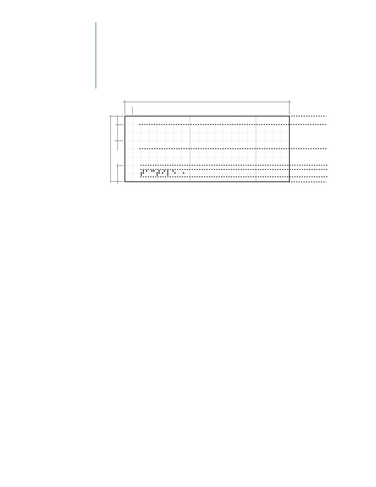
Permanent Room
Identification
and Station
Identification
Signage for Permanent
Length of sign is variable
Rooms and spaces, whose
x
designation will not
change, including station
x
3/8” min.
entrances, must comply
2x
with the ADA.
RAISED 1
Permanent Room
Frutiger 55 Roman
8x**
Identifiers must use all
Raised Characters
upper case letters with a
All Caps
RAISED 2
capital letter height of at
3/8” min.
least 5/8”, but not exceed-
2x
Grade 2 Braille
ing 2” and must be raised
3/8” min.
a minimum of 1/32” from
Raised Characters and Grade 2 Braille
the sign surface. The
Frutiger 55 Roman type-
face is used for all Raised
Character messages within
** 3” module height must be increased to 3 3/8” (9x) to
the Amtrak Graphic
conform to Section 703.3.2 of the current ADA. Other
Signage System.
module sizes do not require this height adjustment.
All Raised Character
messages must be accom-
panied by their Grade 2
Braille equivalent. Braille
words are to be capital-
ized per ADA 703.3.1.
Considerable care must
be taken to translate
messages appropriately,
and differentiate them
from Grade 1 Braille.
It is recommended that a
Braille proofreader verify
final artwork before sign
fabrication.
Braille dots shall have a
domed or rounded shape
and shall comply with
ADA Table and Figure
703.3.1 (see www.access-
board.gov/ada-aba/final.
cfm#a703).
Raised Character spacing
shall be open per ADA
703.2.7.
*x=length of one unit
*x=width of one unit
8x=length of one module
8x=width of one module
■

Graphic
2.9
Components
Use of Dividers
Divider Square
The divider square is a
graphic component of A2
Sign Types (City Identifier
with Direction Bar). It is
City Name
used to separate opposing
directions (indicated by
the name of origin/desti-
nation cities) of the train
Direction
Direction
at a given station stop.
The size of the divider
square is determined by
2x
the value of 2 units* (2x)
of the given sign module.
Sign Module
Divider Line
Divider lines are horizon-
Message
Line 1
tal guides used on most
Amtrak signs to indicate
changes in sign modules.
The Sign Module Divider
Message
Line 2
Line is always painted to
contrast with the back-
ground color of the sign
module it is positioned
Message
Line 3
on, and is always 1/8”
in thickness.
Preview Bar
Divider Line
Divider lines used in
Preview Bars are verti-
cal guides used to sepa-
Message Line 1
rate Preview Symbols
grouped by a common
directional arrow. Preview
Bar Divider lines are 1/4”
thick, and are painted to
match AMT Blue.
*x=length of one unit
*x=width of one unit
8x=length of one module
8x=width of one module
Graphic
Components
2.10
Signage System
Colors
The following paint
Satin AMT Blue
Satin Silver
Satin Scarlet Red
specifications have been
provided to ensure
Matthews Paint
Matthews Paint
Matthews Paint
consistency in color
VOC#
VOC#
VOC#
throughout the Amtrak
SVOC1142SP
MP18073
SVOC1340SP
Graphic Signage System.
Colors used for Amtrak
signs have been speci-
Avery® Ultimate Cast
3MTM ScotchcalTM
3MTM ScotchcalTM
fied to match Matthews
Opaque Film
ControltacTM Film
ElectrocutTM Film
Paint, which is specially
Majestic Blue
Light Silver Metallic
Geranium 7725-63
formulated for the sign
UC 900-625-O
180C-220 (Opaque Vinyl)
(Opaque Vinyl)
industry. For additional
information on the
Amtrak Paint System
Arlon Calon® Series
3MTM ScotchliteTM
refer to page 11.1.
2500 Translucent
Reflective Vinyl
Vinyl Film
Ruby Red 680-82
Vinyl materials have
been included as cost
2051 Blue
alternatives, however,
vinyl usage is discour-
aged unless specified on
the design intent draw-
ing for each Sign Type.
Reference numbers for
Satin White
Satin Black
Satin Clear Coat
vinyl materials from vari-
ous manufacturers have
been included for closest
Matthews Paint
Matthews Paint
Matthews Paint
color matching to paint
VOC#
VOC#
VOC#
colors.
SV202SP
SV923SP
Satin Clear
281228
The environmental
regulations of some
3MTM ScotchcalTM
3MTM ScotchcalTM
states require the
ElectrocutTM Film
ElectrocutTM Film
use of Low Volatile
Organic Compound
White 7725-10
Black 7725-12
(VOC) paints. To
(Opaque Vinyl)
(Opaque Vinyl)
promote better air
quality nationwide,
Amtrak has adopted
3MTM ScotchliteTM
3MTM ScotchliteTM
the use of low VOC
Reflective Vinyl
Reflective Vinyl
paints for all its
White 680-10
Black 680-85
signage.
Comment
Reflective vinyl films with
prismatic or diamond-
shaped patterns should
not be used on Amtrak
signs.
■

Graphic
2.11
Components
Use of Arrows
The arrow must be used
consistently throughout
all sign applications.
It provides information
regarding direction.
The various positions
for possible use of the
arrow are illustrated on
this page.

Graphic
Components
2.12
Corporate Identity
The Amtrak corporate
1a) Amtrak® Brandmark
brand is symbolic of the
(Horizontal Format)
promise that Amtrak
makes as an organization
to its passengers, stake-
holders, opinion leaders
and employees. It is a
manifestation of all of
the different aspects that
come together to create
the "Amtrak Experience".
Signs that incorporate
the use of the Amtrak
brandmark are to be
displayed according to
1b) Amtrak® Brandmark
these standards. For
(Vertical Format)
authorized artwork
and guidelines for the
corporate brand contact
BrandManagment@
amtrak.com.
The brand identity signa-
ture features a travel
mark whose shape,
convergent lines, and
suggestion of movement
capture the excitement
of the travel experi-
ence, also reflecting
the company's growing
strength and reliability.
The custom designed
Amtrak lettering repre-
sents a corporation that
puts safety, comfort
and enjoyment of every
passenger first. Applied
consistently, the Amtrak
brand signature will
stand for Amtrak's role in
the travel marketplace.
Amtrak is a registered
mark of the National
Railroad Passenger
Corporation.
■

Graphic
2.13
Components
Amtrak Specific
Symbols
2) Acela Express®
The Corporation owns
other registered marks
including Amtrak’s
Metropolitan Lounge®,
Auto TrainSM, Amtrak®
Express, Superliner®,
Amfleet®, Acela
3) Self Serve
ExpressSM, etc. While
Ticketing
these marks are accom-
panied with the ®
designation in print
applications, the ® is
not included on signage,
unless the signage is
co-branded (see 2.19).
4) Amtrak’s
Metropolitan
These symbols refer to
Lounge
unique services provided
by Amtrak. In some cases
they incorporate the
corporate name, logo-
type, symbol or corporate
colors.
Symbols have been
numbered to assist in
the ordering process.
5) Amtrak®
Express
Shipping
6) Amtrak®
7) Amtrak®
Club Acela
Thruway
Bus

Graphic
Components
2.14
Passenger Services
Symbols
These symbols refer to
services provided within
stations available to
Amtrak customers. They
identify services such as
the purchase of tickets
and assist in passenger
8) Tickets
9) Baggage
10) Tickets and
11) Waiting Area
and baggage processing.
Check-in
Baggage
Check-in
Symbols have been
numbered to assist in
the ordering process.
12) Customer
13) Information
14) Baggage Claim
15) Unclaimed
Services
Baggage
16) Baggage
17) Lockers
18) Parcel Check
19) Luggage Carts
Storage
20) Buses
21) Taxis
22) Buses
23) Trains
and Taxis
24) Car Rental
25) Passenger
26) Passenger
27) Passenger
Drop-off
Pick-up
Drop-off and
Pick-up
■

Graphic
2.15
Components
Public Services
Symbols
These symbols identify
services available for the
comfort of the general
public. They appear on
signs within station envi-
ronments and refer to
28) Telephone(s)
29) Restaurant
30) Water
31) Lost &
station services generally
Fountain
Found
not specific to train travel.
*Public Services symbols
displayed without accom-
panying text.
Symbols have been
numbered to assist in
the ordering process.
32) Shops
33) ATM*
34) Vending
35) Mail Drop
36) Women
37) Men
38) Restroom(s)
39) Diaper
Changing
Facility*
40) Escalator(s)
41) Escalator
42) Escalator
43) Elevator
(Up)
(Down)
44) Stairs
45) Stairs (Up)
46) Stairs (Down)

Graphic
Components
2.16
Regulatory Symbols
These symbols appear on
signs that are mandatory
in station environments.
Regulatory symbols
display rules-of-order for
conduct or prohibited
activity as stated by local
47) Parking
48) No Parking
49) Bicycle Parking
50) Caution
regulations, building
Notice
owners or other authori-
ties. They exist mainly
to warn and protect
people against danger.
They are also used on
signs informing people
of procedures such as
traffic control and exits.
51) Do Not Enter
52) Exit
53) Smoking Area
54) Smoke-free
Regulatory symbols also
Area
provide information
about procedures in the
event of emergencies
such as fire.
Symbols have been
numbered to assist in
the ordering process.
55) Fire
56) In the Event
57) No
58) No
Extinguisher
of Fire
Skateboarding
Rollerblading
Use Stairs
59) No
Bicycling
■

Graphic
2.17
Components
Symbols of
Accessibility
These symbols display
services available to
people with disabilities.
They appear on signs
that direct or identify
special services within
station environments.
60) Symbol of
61) Text
62) Adjustable
63) Assistive
Accessibility
Telephone
Volume
Listening
Symbols have been
(TTY)
Telephone
numbered to assist in
the ordering process.
64) Accessible
Elevator(s)

Graphic
Components
2.18
Preview Bar Symbols
The Preview Bar is a
communication device
used in directional signs
to display in pictorial form
only, the general direc-
tion of the services most
frequently asked about.
7) Amtrak
13) Information*
20) Buses*
21) Taxis*
Preview symbols are
Thruway Bus*
easily-recognized symbols
(painted to match AMT
Blue) used to direct
towards upcoming
services without accom-
panying text.
The Amtrak-selected
Preview Bar symbols
22) Buses
23) Trains*
28) Telephone(s)*
36) Women*
(easily-recognized
and Taxis*
symbols) to be used
within the Preview
Bar are shown here. It
is recommended that
Preview Bar symbols
be kept to a maximum
of three (3) within the
Preview Bar.
37) Men*
38) Restroom(s)*
*Symbols displayed with-
out accompanying text
when placed within the
Preview Bar.
Symbols have been
numbered to assist in
the ordering process.
■

Graphic
2.19
Components
Other Carriers
Co-branding
Opportunities
In instances where other
carriers share facilities
and services with Amtrak,
co-branding opportu-
nities for intermodal
connections are created.
In Amtrak owned or
operated facilities the
Amtrak brand should be
more prominent than
other carriers and should
be at the top and/or the
left of the sign layout.
Co-branding at Amtrak Facility
In facilities owned or
operated by others, the
Amtrak logo should be in
proportion to the logos
of the other carriers and
should be at the bottom
TRANSIT
or the right of the sign
layout.
Co-branding at Another Carrier’s Facility
The Amtrak logo is to
be accompanied by the
® designation on co-
branded signs.
The Americans
3.1
with Disabilities
Act (ADA)
History of the Act
The Americans with Disabilities Act
The ADA mandates
that places of work
The Americans with Disabilities Act (ADA) was signed
and play be inclusive
into law on July 26, 1990. This civil rights legislation
to all and that spaces
provides equal access and opportunities to all
be made accessible
Americans with disabilities.
to all Americans with
The major component of the ADA with design ramifica-
disabilities.
tions is Title III of the Act. Under Title III, people with
A graphic overview of
disabilities are entitled to the full enjoyment of the
the ADA requirements
goods, services and access offered by most places of
has been included in
public accommodation and commercial facilities to the
this chapter to illus-
general public. The final rules and design guidelines
trate the application
implementing Title III were published in the Federal
of these requirements.
Register of July 26, 1991.
It is important to
remember that design
In 2004 the U.S. Access Board published new design
and construction
guidelines that cover access for people with disabilities
requirements are only
under the ADA. These guidelines were adopted by the
a small part of the
US Department of Transportation, effective November 29,
ADA.
2006.
Technical assistance
The new guidelines update access requirements for a
concerning the
wide range of facilities in the public and private sectors
ADA Accessibility
covered by the law. Revisions have been made so that the
Guidelines (ADA) is
guidelines continue to meet the needs of people with
available from the
disabilities and keep pace with technological innovations.
U.S. Architectural and
The guidelines also feature a new format and organiza-
Transportation Barriers
tion and have been extensively edited for greater clarity.
Compliance Board at:
800-872-2253 (Voice),
Sections of the new guidelines applicable to signage
202-272-5447 (Fax),
include:
202-272-5499 or
•
216 (Signs-Scoping)
800-993-2822 (TTY),
• F216 (Signs-Scoping)
td@access-board.gov
•
307 (Protruding Objects)
•
407.2.3 (Hoistway Signs)
Information on
•
502.6 (Parking Spaces-Identification)
subjects such as
•
703 (Signs)
economic feasibility
•
810.6 (Rail Station Signs)
and technical assis-
The new guidelines include substantive changes to these
tance concerning
sections, particularly 703.
Title III of the ADA
Local Building Codes and ADA
regulations is avail-
able from the
Many state and local building codes, including Title 24—
Department of
the California State Building Code—contain requirements
Justice Office on
pertaining to accessibility. In some cases, the accessibility
the Americans with
requirements of these state and local codes may exceed
Disabilities Act at:
those of the ADA. It is recommended that all state and
800-514-0301 (Voice)
local codes be consulted to conform with such codes as
or 800-514-0383 (TTY).
well as with the ADA.
The Americans
with Disabilities
3.2
Act (ADA)
ADA Highlights
General Requirements
The following pages
The following requirements conform with the
highlight important
current ADA Accessibility Guidelines published
points addressed
in the Federal Register July 23, 2004 amended
by the new ADA
August 5, 2005 and adopted by the Federal DOT
guidelines regarding
on November 26, 2006. In a key revision, the
signage. The new
new guidelines make a distinction between
guidelines are
Tactile (Raised Characters and Braille) and Visual
available at www.
Characters, as explained in ADA 703.1.
access-board.gov/ada-
Raised Character Requirements (ADA 703.2)
aba/final.cfm.
•
Raised Character messages are required for Permanent
These highlights
Room Identifiers. These messages shall appear exclu-
serve as a reference
sively in upper case letters in Frutiger 55 Roman.
and explain how
Raised Characters shall be 1/32“ minimum above their
the Amtrak Graphic
background.
Signage System
•
Frutiger 55 Roman complies with the character
conforms with the
and stroke width parameters required for Raised
new regulations. The
Characters by the ADA: The characters are sans serif,
actual ADA guidelines
the character width of the uppercase “O” is within 55
should always be
percent minimum and 110 percent maximum of the
consulted in addition
height of the uppercase “I”, and the stroke thickness
to these highlights.
of the uppercase “I” is within 15 percent maximum of
To provide an effective
the character height.
wayfinding system, it
•
Characters shall not be italic, oblique, script, highly
will often be advisable
decorative, or of other unusual forms. Character
to go beyond the mini-
height measured vertically from the baseline of the
mum requirements of
character shall be 5/8“ minimum and 2“ maximum
the ADA guidelines,
based on the height of the uppercase letter “I”.
particularly when
required by state and
•
Character spacing shall be measured according to
local codes.
guidelines established in ADA 703.2.7.
•
Spacing between the baselines of separate lines of
Raised Characters within a message shall be 135
percent minimum and 170 percent maximum of the
Raised Character height.
•
Raised Characters should not have sharp or abrasive
edges.
Braille Requirements (ADA 703.3)
• Raised Character messages shall be accompanied by
Grade 2 Braille message equivalents. Braille dots shall
have a domed or rounded shape and shall comply
with ADA Table 703.3.1.
• For Braille dimensions and capitalization, refer to
text of ADA section 703.3.1, and to Table 703.3.1 and
Figure 703.3.1.
■
The Americans
3.3
with Disabilities
Act (ADA)
ADA Highlights
(continued)
• Braille shall be positioned below the corresponding
text. If text is multi-lined, Braille shall be placed below
the entire text. Braille shall be separated 3/8“ mini-
mum from any other Tactile Characters and 3/8“ mini-
mum from raised borders and decorative elements.
Visual Character Requirements (ADA 703.5)
•
Frutiger 55 Roman and Frutiger 65 Bold typefaces shall
be used on all Amtrak signs with Visual Characters.
The selected typefaces conform with the character
and stroke width parameters required for Visual
Characters by the ADA: The character width of the
uppercase “O”s are within 55 percent minimum and
110 maximum of the height of the uppercase “I”s, and
the stroke thickness of the uppercase “I”s are within
10 percent minimum and 30 percent maximum of the
character height.
•
Characters shall be uppercase or lowercase or a combi-
nation of both. Characters shall be conventional in
form. Characters shall not be italic, oblique, script,
highly decorative, or of other unusual forms.
•
Minimum required character height of primary desti-
nation and identification messages varies, based on
mounting height and viewing distance, and shall
conform with minimum character heights indicated
in Table 703.5.5 of the ADA. According to the Society
for Environmental Graphic Design’s ADA/Accessibility
Committee, descriptive or explanatory messages that
support primary destination and identification are
exempt from this guideline.
•
Character spacing between individual characters shall
be 10 percent minimum and 35 percent maximum of
character height.
•
Spacing between the baselines of separate lines of
characters within a message shall be 135 percent
minimum and 170 percent maximum of the character
height.
Pictograms or Symbols (ADA 703.6)
• Where Pictograms are provided as designations of
permanent interior rooms and spaces (Permanent
Room Identifiers), the Pictogram shall have a mini-
mum field height of 6” and shall be accompanied by
a Tactile (Raised Characters and Braille) text descriptor
directly below the Pictogram field, but not within the
Pictogram field.
The Americans
with Disabilities
3.4
Act (ADA)
ADA Highlights
(continued)
• Pictograms that are used to provide information
about or direction to a facility’s spaces and services,
including the international symbol of accessibility,
are not required to have text descriptors.
• Per California Title 24, men’s restrooms shall be
identified by an equilateral triangle 1/4” thick with
edges 12” long and a vertex pointing upward.
Women’s restrooms shall be identified by a circle
1/4” thick and 12” in diameter. Unisex restrooms
shall be identified by a 1/4” thick equilateral trian-
gle superimposed over a 1/4” thick 12” diameter
circle.
Finish and Contrast
• Characters, Pictograms, and backgrounds shall have
a non-glare finish.
• Characters and Pictograms shall contrast with their
field, with either a light figure on a dark field or a
dark figure on a light field.
Sign Mounting
•
Signs mounted within 27” from the floor to 80”
from the floor shall not protrude more than 4”
from the wall surface or 12” from posts or pylons.
•
Large interior and exterior signs projected or
suspended overhead shall be mounted at a mini-
mum of 80” from floor to bottom of sign.
•
For wall mounted Permanent Room Identifiers,
Raised Characters shall be located 48“ minimum
above the finish floor or ground surface, measured
from the baseline of the lowest Raised Character
and 60“ maximum above finish floor or ground
surface measured from the baseline of the highest
Raised Character.
•
Visual Characters shall be 40“ minimum above
finish floor or ground surface. Refer to Table
703.5.5 in the ADA for guidelines on Visual
Character mounting and character heights.
•
Where a Permanent Room Identifier is provided
at a door, the sign shall be located alongside the
door at the latch side. Where a Permanent Room
Identifier is provided at double doors with one
active leaf, the sign shall be located on the
inactive leaf.
■
The Americans
3.5
with Disabilities
Act (ADA)
ADA Highlights
(continued)
• Where a Permanent Room Identifier is provided at
double doors with two active leafs, the sign shall
be located to the right of the right-hand door.
Where there is no wall space at the latch side of
a single door or at the right side of double doors,
Permanent Room Identifiers shall be located on the
nearest adjacent wall.
• Permanent Room Identifiers shall be located so
that a clear floor space of 18” minimum by 18”,
centered on the tactile characters, is provided
beyond the arc of any door swing between the
closed position and 45 degree open position.
Public Services
•
Text Telephones (TTY), Volume Control Telephones
and Assistive Listening Systems shall be desig-
nated with a sign and shall be identified by the
corresponding symbol. Directional signage indi-
cating the location of available Text Telephones
is required at banks of telephones where these
services are not provided.
•
If all entrances to a facility are not accessible,
accessible entrances shall be identified with the
International Symbol of Accessibility. Directional
signs that indicate the nearest accessible entrance
shall be provided at all non-accessible entrances.
Similar guidelines apply to restroom facilities.
•
Signs identifying accessible parking shall include
the International Symbol of Accessibility and shall
not be obscured by parked vehicles. Signs identify-
ing van accessible spaces shall contain the designa-
tion “Van Accessible”. A mounting height of 80”
from the bottom of the sign to the curb is recom-
mended.
•
Permanent signs providing information about or
direction to services and areas within a facility
shall comply with ADA 703.5. Building directories,
occupant names, company names and logos, build-
ing addresses, and signs considered temporary are
exempt.
///////////////////////////////////////